Hopefully, we can all agree, a Free-Standing Display Unit (FSDU) in-store isn’t just there to sell products. They’re there to signpost the category, to communicate a brand message, as well as to educate and advertise. As such, the placement of the FSDU can be just as important as what it looks like.
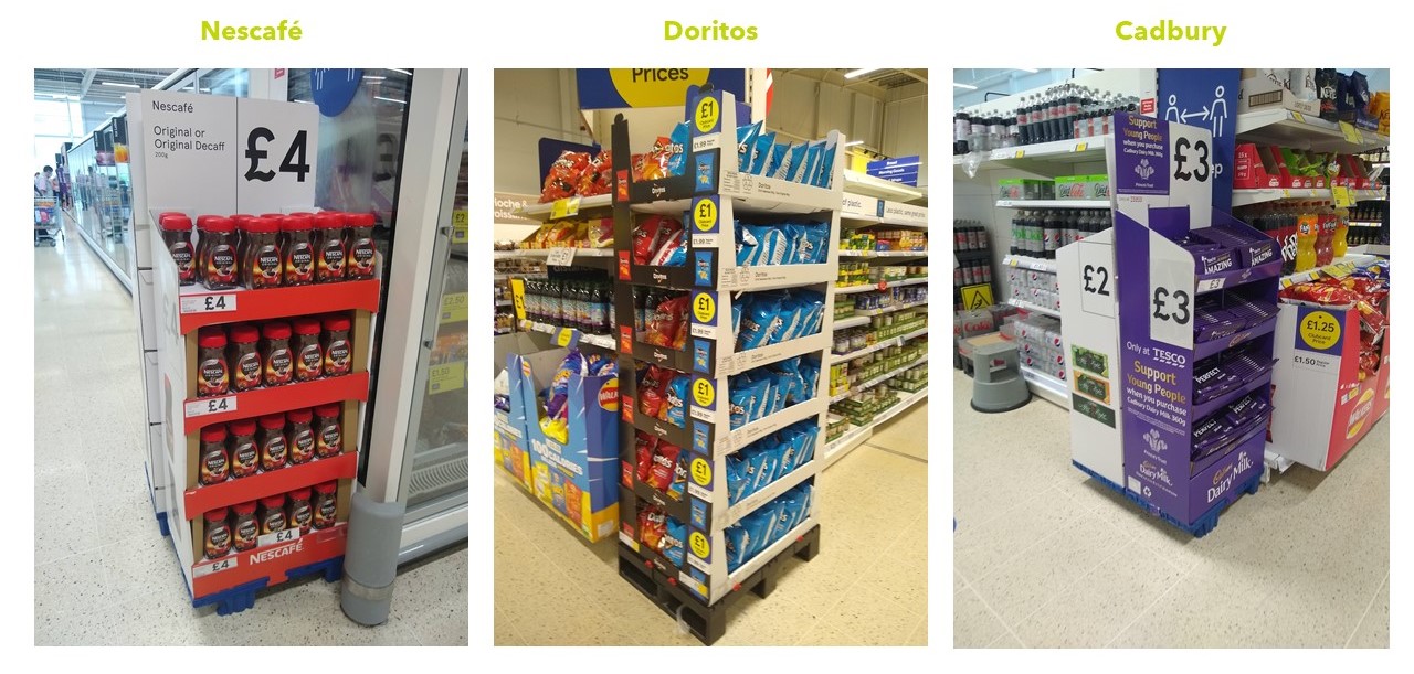
With this in mind, it’s interesting to see how Tesco are approaching their FSDU execution in-store, and ask our LinkedIn audience about what they thought was the best one, and here were the results!
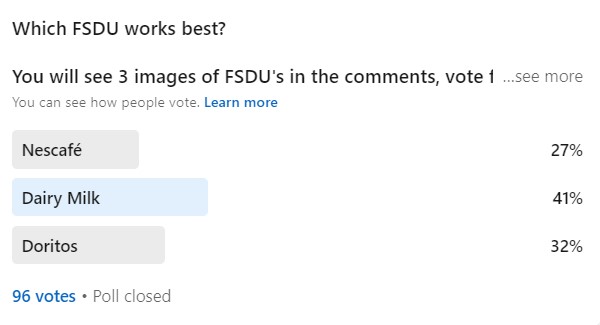
What we think about the 3 Free Standing Display Units
The Nescafé activation is relatively typical of the types of FSDU you see in Tesco today. Brand colours flush with the front of the display, with white sides displaying the product and price.
From the front, the display does a very subtle job of triggering the brand assets of Nescafé. The brand logo at the bottom may as well be redundant, since a ‘shopper’s-eye’ view is rarely straight down, so it’s unlikely this would register either from a distance or directly in front of it.
The red however does a great job of triggering an overall ‘Nescafé-red’. But if the purpose of this FSDU was to signpost, or trigger a coffee mission, then the white sides and top do nothing to attract attention. One of the key things that attract attention is salience i.e. ‘does it stand out from the environment, and in a predominantly white/neutral store, white isn’t going to cut it.
The rationale here is probably that they want to let the product do the talking, so by allowing the product itself to stand out, it’s helping. But this means we’re left with nothing but a shelf, and a wasted opportunity to really utilise the space. In a shop full of products on shelves, it’s unsurprising that simply putting more products on shelves isn’t going to attract attention.
However, placing products adjacent to passing footfall could (i.e. visible to traffic in the power aisle), could facilitate increased awareness of the product of category, however the positioning of the Nescafé FSDU only enables the white side of the display to be seen, rather than the brand colours, and price communication. A good FSDU needs to use all available space to deliver its goal.
The Doritos display however does this well. By cutting out the white, and displaying the ‘cool’ blue of it’s packaging, it’s far more likely to trigger its distinctive assets to both passing and immediate traffic, compared with the Nescafé end.
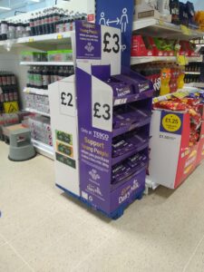
But the real winner (for me and our audience), is the Cadbury’s display. This similarily communicates it’s message and brand assets on all sides of the display, but the solid ‘Cadbury purple’ ensures the maximum potential for triggering a ‘Cadbury’ response with shoppers, as well as using all the space available to communicate message, price, and product.
The blur test
A quick way to test whether any activation will be easily visible or engaging to shoppers is the blur test. As you can see below, despite the blurring, it’s much easier to tell the associated brand for Cadbury, than it is for the other displays.
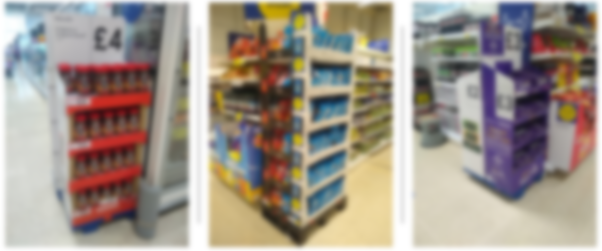
From my own point of view, I would love to know if there was any logic as to where in the store these were placed. Coffee and the Frozen category seem like a stretch, and Doritos with Canned Veg isn’t obvious. Chocolate and soft drinks seem marginally more logical. Spark Emotions’ own research shows that when FSDU’s or Ends are placed at the end of the aisle to the category they correspond to, they significantly increase traffic to the category through signposting, and conversion to purchase.
Thank you to everyone who took the time to vote! It’s great that we are in agreeance! If you have any builds on why you voted the way you did, we’d love to hear why.
How we can help
Here at Spark Emotions, we are able to quantify the emotions of consumers and shoppers to understand how they really feel about your brand, pack or media. We are able to help you make informed changes to ensure your messaging and creative is as effective as possible to help you deliver the desired result.
Related articles

Written by Will Morgan, Associate Director at Spark Emotions
If you have any questions, feel free to reach out to Will via email will.morgan@sparkemotions.com or connect on LinkedIn


