
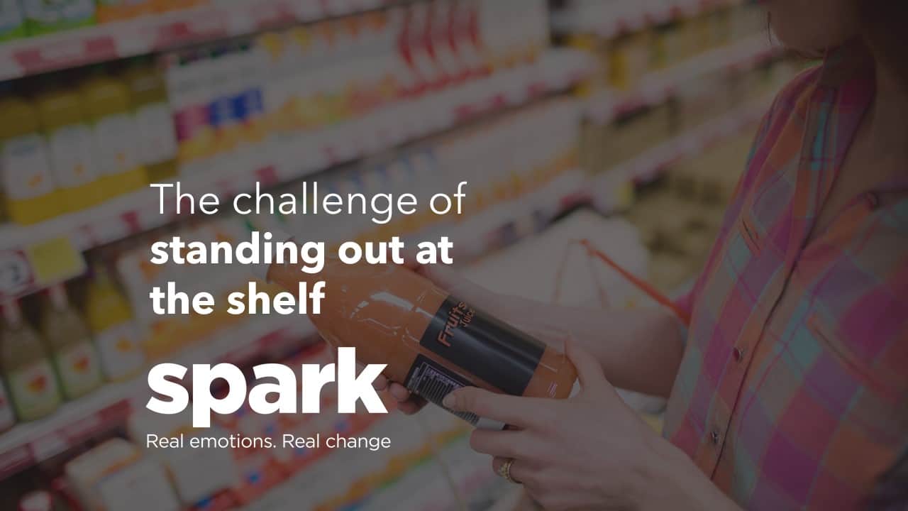
Standing out at shelf is what plagues most shopper marketers’ minds on a daily basis. But the challenge of getting visibility is often something that can be easy to plan, but harder to execute. Here I’m going to look at some of the key things to consider in the equation when working out how to get a brand or product to stand out on the fixture.

Context and being different (Salience)
Before I talk about anything specific with standout, the most important thing you need to consider is the context of the wider category/space. What works in one category will not work in another. For example, basic white packaging will stand out in a colourful category (go check out the brand HG in the cleaning aisle in Tesco, or Veetee rice in the Microwave Rice aisle in Morrison’s), but that same packaging would struggle to get noticed elsewhere where white is a dominant colour.
Colour and beauty do not equal more standout.
Before understanding any research into visibility, you need to start with how the category looks. What shapes are dominant? What colours do you mainly see? What’s the dominant language used? From here you can identify the gaps where your brand can stand out. If you want to be noticed, the goal is to be different.
Think about how you can create:
- A different colour to the category norms
- A different orientation to the category norms
- Be a different size or shape to the category norms
The more of these you can tick off, the more attention you can feasibly grab.
When you finally create your plan for how to standout at shelf, always ensure you test it in the environment of the category. Don’t stick the design on a big canvas all on its own, and ask people what they think, because that’s not how shoppers are going to view it. It needs to be seen in the context of everything around it.
This explains why ‘brand-blocking’ can be so effective in the category. By creating a larger sub-block of products, you create a bigger space of saliency for your product to standout.
Employing ‘the blur test’ is a great way of then seeing how much you really standout. Take a picture of your brand on shelf, blur the image slightly, then see how much your product stands out…

People and animals
We’re hardwired to notice our own species. Using imagery of people is a neat little shortcut to forcing attention towards your product/activation (even if it can look a little cheesy).
Faces are the most powerful part of a person when it comes to attracting attention. We literally cannot miss a face (even if we don’t subsequently remember it). At a neurological level, our brain has distinctive areas that focus just on detecting and interpreting faces.
We also have brain regions that detect bodies and body parts as well, so if you want to avoid faces, it can also be advantageous to employ the wider human body to grab attention.
In similar way, we’re also always on the look out for potential predators or prey in the form of animals. There’s no specific animal we’re looking for, but the more threatening the animal is, or the more friendly (and arguably human-like) is, the more likely it is to capture our attention.
Movement
Probably the most under-used aspect of standing out is employing movement into the shelf/category.
From an evolutionary perspective, things that a moving present a potential threat, or a potential meal, so things that move will almost always capture our attention versus something static. The more unpredictable and sudden the movement, the more likely we are to notice it.
The interesting thing is that even perceived motion can attract attention i.e., something that looks like it is moving (even when its not). For example, an image of something falling is more likely to capture attention than something standing on top of a flat object. A car driving vs parked, or a horse running vs standing still.
By adding in any motion (perceived or otherwise) into your packaging or activation, you stand a better chance of creating standout.
(But just remember that if everything is moving, then you should be the one staying still!)
Relevance
Things that are relevant to our personal goals and values also stand out more to us than those that aren’t. We’re constantly looking for things that fit with our current and future goals. In evolutionary terms, this would be food for our survival, so particular colours for berries we like, or certain animal shapes would be our main focus. Now we’re focussed on key brands, messages related to our needs, and price points.
It may sound obvious, but ensure your activation (and broader message) is focused around what the customer is actually looking for, and their wider needs.
Novelty
Whilst relevance to our mission is vital, novelty plays a big role in driving attention. Brands have often made the mistake of creating incredible activation or packaging that creates great standout, but over time, it becomes more like wallpaper. Think about the post-it you’ve left on your fridge for the last few months with that urgent thing you needed to do. It’s easy for things to blend into the background quickly.
New and changing stimuli are more likely to grab attention than familiar items, so giving your activation/packaging plans a shelf life is important. Alternatively, ensure you have additional ways of building on your standout through the life cycle of the product (e.g. SRP, shelf-edge labels, stickers, etc.)
(Again, this can be very context dependent!)
Eyeline
Finally, when considering standout, remember that our main focus of vision is never upwards. We tend to look slightly below the horizontal when going about our day, so everything above this needs to really attract our attention.
Objects on the floor are slightly more likely to get noticed, as we’re always looking for anything ahead of us that we might bump into or trip over! But if it’s not a potential threat, then we quickly deselect it and move on to our main goals.
Whilst the centre of our vision (our foveal vision) is focussed around what’s in front (and sometimes below) us, our peripheral vision is still working overtime to work out what might be happening all around us. Our peripheral vision doesn’t deal in specifics, but rather broad changes (movement) in colour/orientation/size/shape (think about those times when you’ve noticed something in your rearview mirror when driving even though you weren’t paying attention to it), so if you’re creating something up high or far away, ensure you’re ticking off those key aspects of salience (as mentioned in the first section).
This is another reason why brand blocks in the aisle can be so effective. They create a wall of colour that presents a more obvious areas for our peripheral vision to latch on to.

Conclusion
There’s no one size fits all approach to standing out at shelf, but by understanding how your product measures against the colour/orientation/size/shape of the wider category, and by using movement, people, and animals (all within the eye-line of your shopper) you can begin to create something that really can’t be missed!
If you would like us to help your brand stand out at shelf, get in touch below

Written by Will Morgan, Associate Director at Spark Emotions
If you have any questions, feel free to reach out to Will via email will.morgan@sparkemotions.com or connect with him on LinkedIn