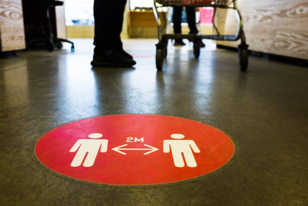
Currently, there is a disproportionate amount of negative messaging in-store. From social distancing measures, to purchase limits, to hygiene messaging. This next case study illustrates that when it comes to the visual appearance of messaging in store, appearance matters.
We were asked to look at the performance of a newly designed in store pharmacy as shoppers weren’t embracing the department as the retailer had hoped. In fact, footfall to the new pharmacy had dropped by more than 10% compared with the previous area.
The newly designed pharmacy counter was framed with a yellow and black chevroned border, aimed at demarking it as an important and ‘serious’ area of the store. A number of specialised research tools were used to go beyond what shoppers said and that really understood why the counter wasn’t working at a deeper psychological level.
The breakthrough insight was that the yellow and black framing around the counter was similar to the electrical warning tape that tells people to stay away. Shoppers were seeing the yellow and black and subconsciously processing it as an area to keep away from. As soon as the yellow and black was removed, footfall increased. Incidentally, the retailer had used the same colours in their healthcare aisles and these too were suffering until the yellow and black were removed.

The science bit
The reason the chevrons scared consumers away from the pharmacy counter is down to a rather unusual psychological effect known as conceptual priming. This is an implicit memory effect whereby exposure to one stimulus (or thing) causes one to think about related concepts, which can lead to a change in behaviour. At the most basic level, if I saw a photo of a cheetah this could prime me to think about other things. Maybe, Africa, lions, housecats, or even the music group ‘the Cheetah Girls’. It all depends on what you associate with the word. But this doesn’t lead to a change in behaviour.
However, if we’re in a supermarket and classical music is played rather than the normal chart music it causes us to spend more money in-store. This happens because shoppers stereotypically associate classical music with upper-class wealthy individuals; consequently, this makes us think about them at a subconscious level, and the products we buy changes to reflect this. We may buy the premium version of the product rather than the normal version.
With careful planning, priming can be used to encourage shoppers to buy specific products, upgrade to premium products or even influence what store someone shops in. But in this case study the yellow and black chevrons accidentally, negatively primed consumers. We normally only see these styles of chevrons when driving. Here it’s a warning about approaching danger, encouraging us to change lanes or slow down. Although the chevrons on the pharmacy counter may not look identical to the ones we see when driving, they still primed us with the same associations. Consequently, we respond in a similar way. We slow down and move away from this area – not an ideal reaction from shoppers if you’re trying to get them to buy things from the counter

Key take-away: Shoppers are conditioned to respond to certain visual stimuli in predetermined ways. Triggering the wrong associations can have powerful consequences on shopping behaviour.
Key take-away: Because life conditions shoppers, there are a number of heuristics that can be deployed in-store to enhance the impact and effectiveness of communication shoppers are conditioned to respond to certain visual stimuli in predetermined ways. Triggering the wrong associations can have powerful consequences on shopping behaviour
- Shoppers are conditioned to respond to certain colours in different ways
- They also respond differently to upper and lower case text
Key take-away: When communicating with shoppers, and before the designers work their magic, identify where else in society, people are similarly but effectively being communicated to, from road signs to warning notices, any design associations with the communication are often more impactful than we realise.
If you would like to read more about how behaviour has been impacted by Covid-19, click here for more articles


