Coca Cola was ranked the world’s biggest plastic polluter of 2020 by Break Free from Plastic, coming top for the third year in a row.
This recurring accolade coupled with the growing consumer awareness around plastic pollution, and its negative effects on animals, our environment and our health, have seen Coca Cola, and similar corporations that play major roles in perpetuating plastic pollution, commit to efforts to tackle the growing plastic problem.
The development of a paper bottle
Amongst the different routes being explored is the development of a sustainable paper bottle that would help Coca Cola become more environmentally friendly and more attractive to environmentally-minded consumers. The new prototype, developed and produced by the Danish company Paboco, was trialled on a limited number of stores in Hungary this summer in a 2,000-bottle trial using Coca Cola’s plant-based drink, AdeZ.
However, alongside questions looking at more technical things, such as the ability of the paper bottle to withstand the pressure of the bottling process, there are questions arising around the ease with which the new bottle prototype will be able to carry the Coca Cola brand identity.

Coca Cola’s glass bottle is iconic
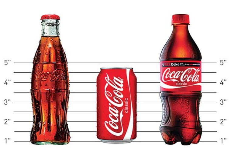
One of Coca Cola’s most distinctive brand assets is its glass bottle. So iconic is its shape that I don’t need to describe or include a picture of it because you know exactly what I am referring to, which makes my point beautifully. This non-brand-name trigger not only evokes the Coca Cola brand but it also ensures Coca Cola has a larger neuro footprint than competitors, creating a neuro-rich brand.
Building this distinctive asset required the shape of the glass bottle to be kept consistent whilst consumers learned the link between it and the brand (find out how we identify distinctive assets here). This was achieved through reinforcement and refreshment of the link over a very long period of time. Therefore, due to the potential limitations of the new paper bottle, achieving the iconic Coca Cola bottle shape might be hard and it might mean the brand choose to forego their most crucial distinctive asset, cancelling out years of consistent brand building effort.
Coca Cola red is instantly recognisable
The Coca Cola colour red is another brand asset that might be affected by the new bottle. The colour is so strongly linked to the brand that other beverage producers are not allowed to use it. The particular shade of red is seen to denote happiness, energy and excitement, as well as Christmas and it is linked to Santa Claus.
It is believed it helps give Coca Cola a boost over Pepsi, as can be seen in the Pepsi Paradox – in a blind taste test Pepsi is always deemed tastier than Coca Cola yet when participants know what they are drinking the tables turn and Coca Cola is scored as tastier. Therefore, ensuring the new bottle will be able not only to carry the inks for the label but also be able to show the exact shade, is important.
Of course, Coca Cola could choose to turn back time and re-instate their iconic glass bottle in order to sidestep the need for R&D, easily maintain their distinctive assets and appeal to the environmentally-conscious consumer (which would be, comparatively, simpler and cheaper in the long run).
How can we help?
Here at Spark Emotions, we are able to quantify the emotions of consumers to understand how they really feel about your brand’s distinctive assets. We are able to help you make informed changes to your brand, pack or media, to ensure the changes you are making will help you deliver the desired result.
If you would like to find out how we can help you understand your brand’s distinctive assets, get in touch below

Written by Amelia Gavrila, Senior Insights Executive at Spark Emotions.
If you have any questions, feel free to reach out to Amelia via email amelia.gavrila@sparkemotions.com or connect on LinkedIn


4 thoughts on “How will a paper bottle impact Coca Cola’s distinctive assets?”
Comments are closed.