
It’s common for brands to consider a brand ‘refresh’ every so often. Whether that’s changing a logo, pack or overhauling communications, it can be a very costly affair. While several brands have done this successfully, there are some who have wasted millions.
Back in 2010, Gap released their new logo to the US market. Gone was the 20-year-old iconic blue square with capitalised letters and in came a small blue box with ‘Gap’ now written in Helvetica.

This new logo immediately prompted ridicule on social media. The new logo was considered ‘cheap’ ‘tacky’ and very ‘ordinary’ and was the subject of many memes. After such negative reviews and comments, Gap reverted to the original logo within 5 days. The cost of this mistake? $100 million.
Gap wanted to appear more ‘modern’ and evolve their identity to be more relevant. What they failed to consider is that consumers may not be ready for this change. Consumers prefer what is familiar to them so even if their 20-year-old design is simple, it still strongly resonated with consumers. Therefore, it can be more rewarding to make small tweaks to an existing logo rather than make wholesale changes to maintain familiarity.
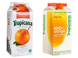
In 2009, Tropicana released its new pack design in the US with the aim of the new design to also be more contemporary. This was partly based on consumer research that said shoppers found the original design to be outdated. The rollout of the new pack resulted in sales plummeting by 20% over 2 months and Tropicana immediately brought back its original design. This pack failure cost them $50 million.
This is a prime example of how it’s important to understand the disconnect between what shoppers say and what they do. A lot of research and important brand decisions are based on claimed behaviour of what shoppers think they like. The truth is, most of these decisions are made below the shoppers’ conscious awareness so they don’t possess the insight into the factors that actually influence their behaviour.
Tropicana didn’t know that the majority of purchases made are automatic and shoppers look for key pack elements to help them find their desired product. In this case, shoppers could no longer look for the orange or the iconic green logo that shoppers associate with the Tropicana pack and therefore, they couldn’t find the product. While there is a desire to be aesthetically pleasing, it’s more important that a product or brand can be found and bought.
At Spark Emotions, not only can we help brands understand the science behind shopper behaviour but we avoid claimed research techniques. Through our brand, pack and media business unit, we help brands navigate the challenge of re-branding their logos and packaging with expert scientific knowledge on how to do is effectively and more importantly, avoid these costly mistakes.

Written by Sinita Govind, Associate Director at Spark Emotions
If you have any questions, feel free to reach out to Sinita via email sinita.govind@sparkemotions.com or connect with her on LinkedIn