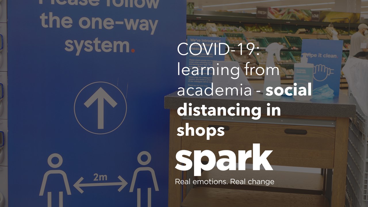
Let’s look at how we can most effectively encourage shoppers to keep their distance in-store. What can science provide in terms of making the already excellent initiatives deployed by retailers even better?
We have often researched the power and effectiveness of in-store communications. And at this time when retailers must communicate key messages with shoppers effectively, we want to make sure that we optimise the likelihood that the messages will be read.
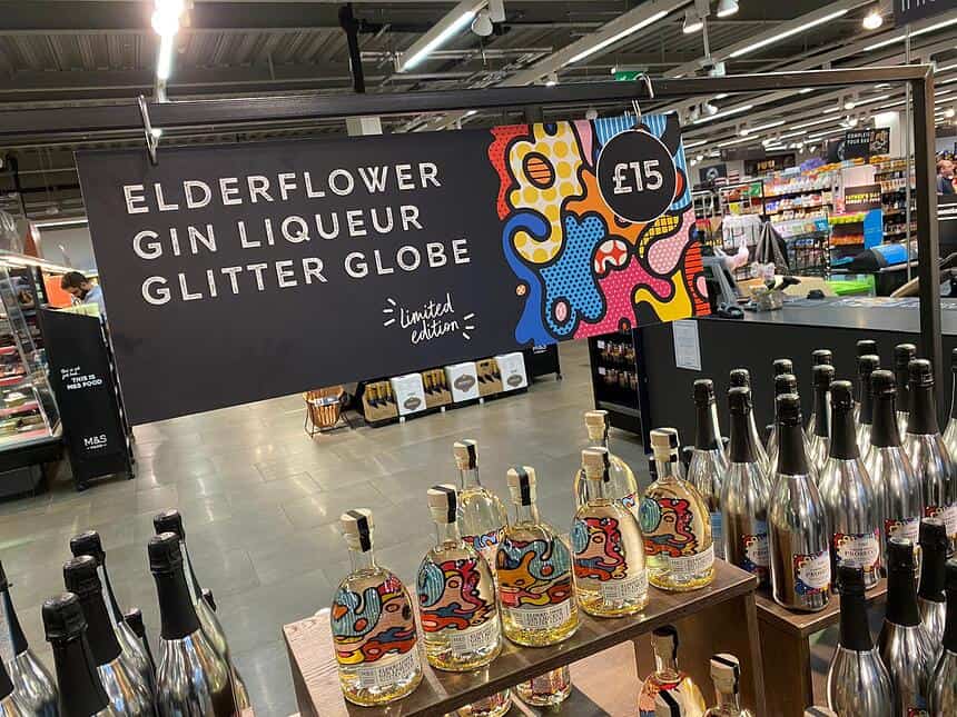
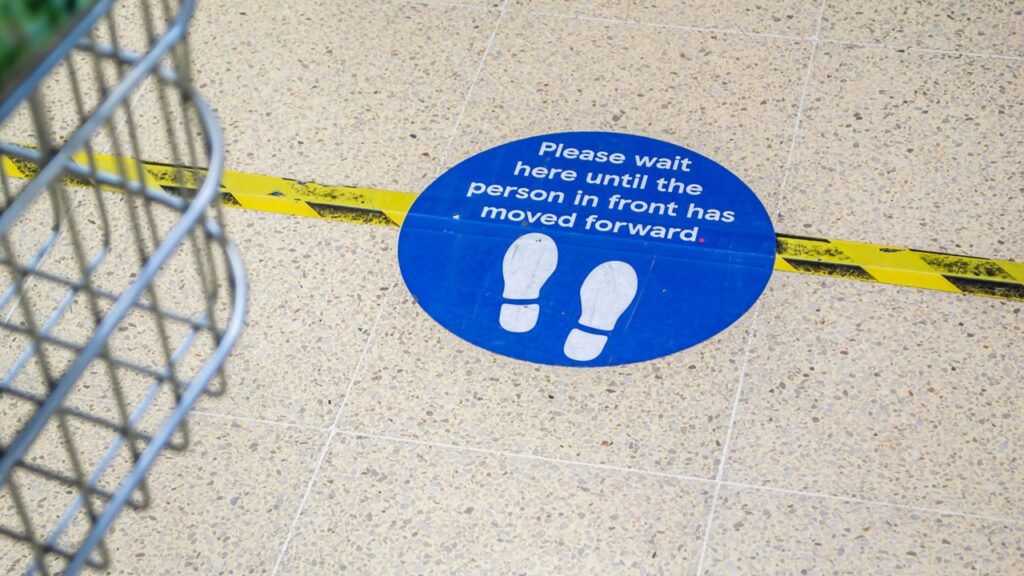
Let’s look at how the effectiveness of in-store communications varies by what is said, how it is communicated and precisely where it is located. In one study, we had a floor graphic that stated: “Stand on this graphic, raise your hand and you will win £10”. During 8 hours in a busy supermarket, how many shoppers took us up on our offer? One.
But in another study, a floor graphic that showed an image of a tempting snack product increased sales of that item by 14%. And in another example, a series of footprints in a DIY store led shoppers successfully to the paint department, delivering again another increase due to the floor graphics.
The science bit
At the moment a primary objective of supermarkets is to keep the store safe for both their employees and customers. To achieve this, they’re having to retrain customers how to behave in-store. This is no mean feat. We’ve spent a lifetime of shopping in a certain way and over time we’ve developed habits – habits we’re now being asked to forget. Consequently, stores have resulted in putting barriers and markers on the floor highlighting just how far apart we need to be standing from one another. All of these concepts help keep the idea of social distancing ‘salient’ or at the top of our consciousness.
For these interventions to work, stores need to rely on visual messages rather than texts. This is for several reasons. Firstly, when it comes to adverts, previous academic research testing 1363 different adverts has shown the picture is the most important element when it comes to capturing attention. Texts just take too much time to process when we’re busy doing other things.
Secondly, even if shoppers did glance and read these messages they’re unlikely to be persuasive. When you are in a supermarket your primary goal is to buy what you need and get out as quickly as possible. We don’t have the time or energy to cognitively process these messages. If anything we view these attempts at persuasion as a distraction and an annoyance. In this context, these promotional messages are potentially going to cause us to have a negative perception of the store. This is because we are actively trying to ignore these messages, in effect we are cognitively retraining our brain to ignore messages from the brand, what psychologists call the distractor devaluation effect. If we subsequently do notice these messages, after this retraining process, we’ll have a more negative evaluation of the messages.
Consequently rational and cognitive routes to persuade us are unlikely to work. Instead, it makes more sense to convince people using a peripheral route to persuasion. These peripheral routes work at a superficial level. Visual cues such as arrows or lines drawn on the floor work because they implicitly tell shoppers what is the default way to walk around the store. While it might sound strange, humans have an innate bias to stick with the default option. Without realising it we think that this is the way we’re intended to explore the store, there must be a reason behind it, and so we follow it.
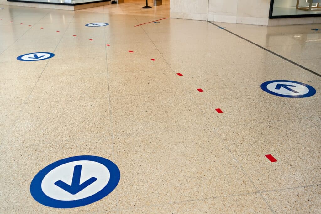
What’s interesting is that in research studies, most shoppers weren’t even aware that they were following lines or arrows. Yet in a study conducted in a supermarket, for example, 90% of shoppers automatically followed large arrows drawn on the floor. However, if lines on the floor are too garish or disrupt the look of a store, a similar effect can be found by installing a different colour carpet or tiles that create a visual pathway around the store. Although this is not quite as effective, approximately 74% of customers still follow this new path around the store.
The other advantage of using arrows at times like this is the fact that it is not continually reminding shoppers about COVID-19. Most of the practices that shops have introduced to allow them to reopen such as, limiting the number of people in the store, only allowing people to walk around the store in a particular direction, and frequent hand washing stations all ‘prime’ shoppers to be nervous and reinforce the fact that it’s not ‘business as usual’.
Key take-away: Images on floor graphics work much more effectively than any written information
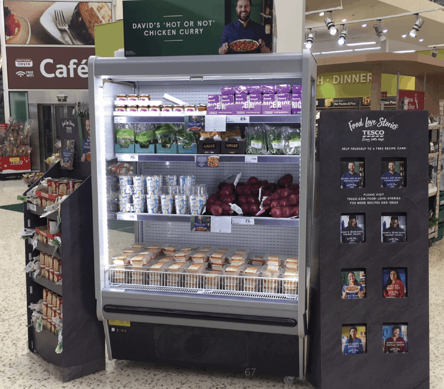
Key take-away: Another separate study also showed that the same is true of information that is above us in-store, either above categories or hanging from ceilings.
Key take-away: The headline finding is that human peripheral vision can’t read, so words that aren’t in our sightlines don’t tend to get read. Images, on the other hand, are what our peripheral vision is constantly on the lookout for Fight, flight, find a mate.
Key Take-away: Use images to get emotional attention in peripheral vision. Then use words to press home the ‘messages’, by presenting them in direct sightlines (foveal vision).
If you would like to read more about how behaviour has been impacted by Covid-19, click here for more articles

Written by Scott Willey, Associate Director at Spark Emotions
If you have any questions, feel free to reach out to Scott via email scott.willey@sparkemotions.com or connect with him on LinkedIn


