The popularity of online shopping has been growing at a remarkable rate and has now become commonplace in modern society. Consumers are looking for quick and convenient ways to shop, saving them both time and effort in their increasingly busy lives.
Spark Emotions is a specialist market research agency and we are experts in understanding how people shop online. We are a team of consumer psychologists and industry leaders that help you to grow your business by understanding the science behind human behaviour. We have worked with some of the world’s leading brands helping them gain a better understanding of their customers.

Online shopping has been further accelerated by COVID-19
At the present time, the online growth that has been seen during the COVID-19 pandemic has slowed slightly as all retail outlets reopened for shoppers. According to the ONS, Q2 in 2021 has seen a drop of internet sales of a percentage of total retail sales, going from 35.2% in Q1 down to 27.1% in Q2. Despite this, 2021 is still way ahead of the last ‘normal’ year in 2019, where Q2 internet sales only accounted for 18.4% of total retail sales. The means online retail is still growing at a significant rate and optimising your online shopping experience is crucial to helping your business grow.
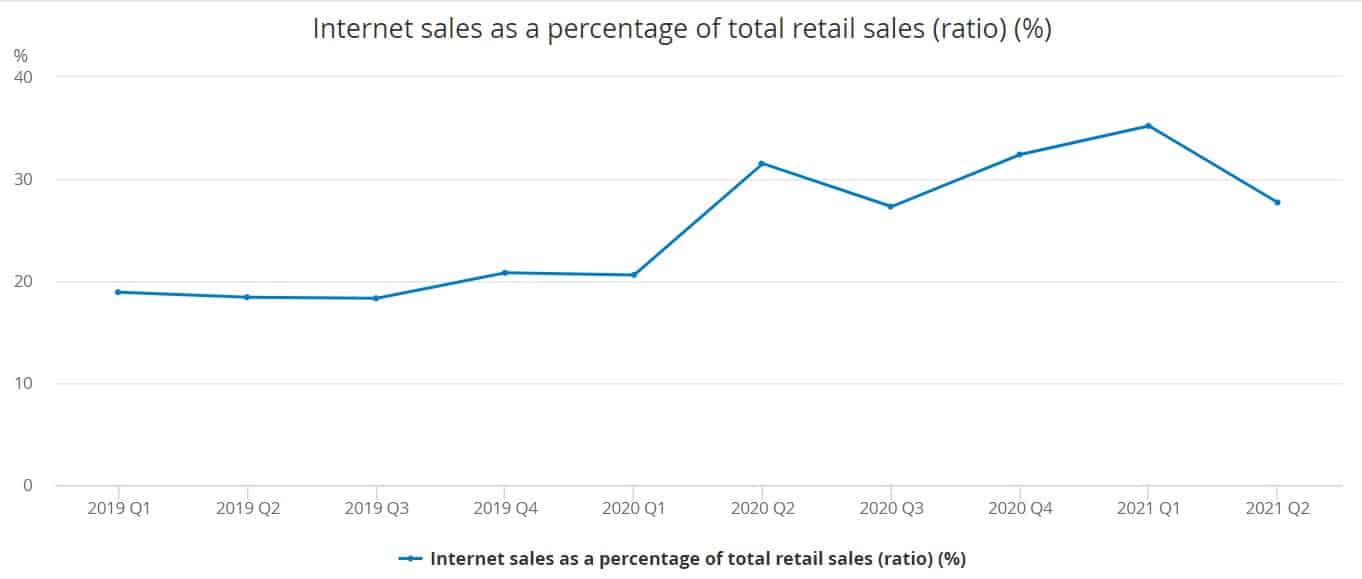
Source: The Office for National Statistics
In addition to being safer and more convenient, the anticipation of waiting for the product can actually be seen to increase the reward, in the similar sense that having to wait to open Christmas presents under the tree makes it all the more exciting. This is called Delayed Gratification.
It therefore makes sense that online presence and online experience should currently be a top priority for businesses. The following will explore how to achieve the optimum shopping experience for consumers online based on simple behavioural psychology.
Dr. Fogg’s behavioural model
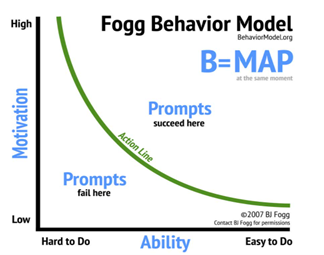
Dr Fogg’s behavioural model was established around the concept that everyone relies on 3 basic elements: Motivation, Ability, and Triggers.
Motivation is sparked when the consumer has a need or desire for a product, or may associate the possible outcomes of purchasing such a product with positive emotions, e.g purchasing fresh vegetables may be associated with living a healthy life.
Ability is important for keeping the levels of motivation high, in terms of online shopping this could be in the form of adequate payment options, clear and useful product descriptions, and in particular a smooth and quick running website or mobile web page, as WordStream states, ‘47% of users expect a webpage to load in 2 seconds or less’.
Finally, triggers are what prompts the consumer into action, for example, advertisements, pop-ups, and call to action buttons. Therefore, the most successful websites are those that can keep motivation high and are easy to use, whilst including clear and concise triggers.
Initial impressions are paramount
Initial impressions are paramount when entering a website, playing just as important a role as the actual content. As mentioned, website loading speed is particularly key and will immediately provide the consumer with an initial either positive or negative impression of the business.
The next thing the consumer will experience is the page they are greeted with upon entering the website. This is once again a vital stage in building a positive image of a brand or business, and the design should be selected with careful consideration.
A study carried out by Adobe found that 38% of people will leave a website if the layout or design is unattractive (2015). It is therefore crucial to consider the target audience and adapt the design accordingly.
Colours act as emotional cues
Colours should be the initial consideration when it comes to design, as they act as emotional cues, and are able to influence our feelings and behaviour. This is due to two reactions as recognized by Crowley (1993): Arousal reaction (characterised by higher adrenaline, blood pressure, and heart rate), and Evaluative reaction (whether or not consumers like the colour). A ‘good’ colour is ultimately reliant on 3 main factors:
- Appropriateness – context in key, e.g people might like the colour blue more than brown but if it is a table that they are buying, brown is likely to be the more popular choice
- Aesthetics – on top of emotional or semantic meaning, the colour must be visually appealing
- Value – social value e.g with clothing, certain colours would be considered fashionable, and functional value e.g black hiking boots would serve better than white hiking boots
(Nick Kolenda, The Psychology of Colour, 2016)
Colour is important, as without any colour at all a website would not be visually engaging, but on the other hand, too much colour can be overwhelming and can complicate the message that is trying to be portrayed. It is also important to incorporate ‘white spaces’ as they visually provide a resting place for the visitor.

Getting the right balance of information
In addition to too much colour, it is possible to include too much information and too much product choice.
When a consumer has lots of information to take in, and lots of choice in terms of where they navigate to next, or which product they are going to click on, they become overwhelmed. This is called Paradox of choice.
As human beings we are indecisive and need as much help as possible, and when faced with a multitude of choices, this can paralyse our ability to make a decision, often resulting in choosing the easy option (default), or not making the decision at all (leaving a retailers website without purchasing).
It is therefore important to be concise. In terms of products, filtering options should go into great detail allowing a shopper to narrow down their search to the exact type of product they are looking for, where they can then make their decision out of just a handful of products.
In terms of the webpage itself and once again that all important first impression, only key information should be included that is likely to be useful to the consumer. It is proven that cleaner and less cluttered websites have considerably lower bounce rates, and this is due to that overwhelmed feeling being prevented.
Trust is key
By incorporating the afore discussed techniques with colour and design, a business will not only be more successful in encouraging engagement, but it will also play a huge role in establishing trust.
While the world of online shopping grows, the stigma and fear around hacking and fraud remains prominent. When you are required to enter your bank details online to purchase a product, consumers will not even consider doing so unless they gain an immediate sense of trust, once again asserting the importance of the first impression.
On top of a professional design and a smooth-running website, an easy way to gain a consumers’ trust is through reviews and third-party influencers.
Nielson Global Trust survey found that ‘92% of people will trust a recommendation from a peer, and 70% of people will trust a recommendation from someone they don’t even know’. Reviews provide consumers with honest and transparent opinions from outsider perspectives. These take into account all of the information, including that which the seller might have sidestepped.
It has actually been found that consumers are more likely to trust brands or products that have both negative as well as positive reviews, as this lessens the suspicion of censorship or faked reviews.
As well as providing shoppers with more ammunition to trust a product or brand, reviews can act as a mechanism for increasing social belonging, tapping into the human desire to share.
By making a website an honest and sociable environment, where consumers are free to leave their opinions as well as seek information through others, the overall shopping experience will most likely be more positive and fulfilling.

Emotion is still a key driver for selling products
It is also important to create an emotional response to the products on a website, and this is possible by thinking about the way in which they are displayed.
Consumers crave context – not only does it make a product easier to process and understand, it enhances the desire for the product as it becomes easier for the consumer to imagine owning it. For example, if a shopper is presented with an image of a scarf around someone’s neck as opposed to on its own, the emotional response is stronger.
The explanation behind this response is down to the presence of Mirror neurons – a group of neurons in our brain that fire not only when we complete an action, but also when we see others doing so. In essence we understand and empathise with others’ feelings by actually feeling them ourselves (Kilner & Lemon, 2013). Thus, showing products being used correctly can be an effective way to connect with the customer, and combat the interactive barrier that shopping online presents.
In a world where online shopping is becoming the new norm, it is important that the enjoyment and pleasure that is the very essence of shopping is not lost. Businesses should be working harder than ever to ensure that their online presence does all it can to ensure consumers experience a smooth, engaging, and pleasurable shopping journey.
We can help you drive more sales through your website by getting to the truth of who your customers are, how they feel and behave and what make them decide to buy or not. If you would like to know more, fill in our contact form and one of the team will be in touch

Written by Holly Adams, Research Manager at Spark Emotions.
If you have any questions, feel free to reach out to Holly via email holly.adams@sparkemotions.com or connect with her on LinkedIn




One thought on “Online shopping – what makes a great website?”